Family photo color schemes can make a big difference in the overall look and feel of your pictures. Choosing the right colors can enhance the mood and create a cohesive look for your family photos. Discover some tips and ideas for creating stunning color schemes in your next family photo shoot.

Choosing the Perfect Family Photo Color Scheme: Tips and Inspiration
Choosing the Perfect Family Photo Color Scheme: Tips and Inspiration
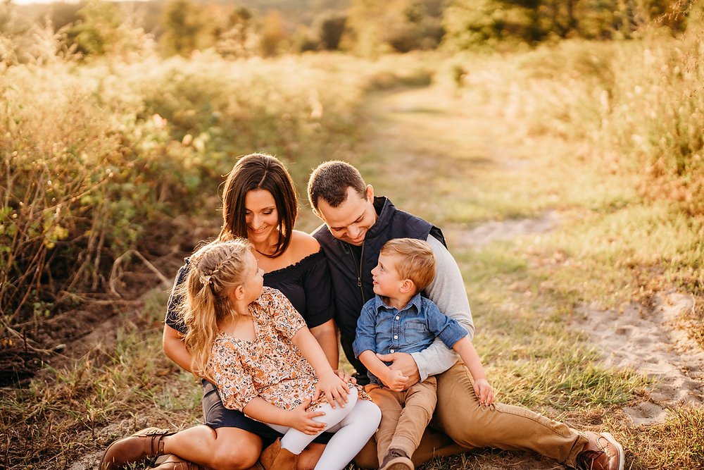
When selecting a color scheme for your family photo, consider opting for complementary colors that work well together. Earth tones such as browns, greens, and blues can create a harmonious and soothing look for your picture. Alternatively, you can go for bright and bold colors to add a fun and energetic vibe to your family photo.
Coordinate your outfits by choosing colors that complement each other rather than perfectly matching. This will create a visually appealing image without being too uniform. Don’t forget to take into account the background of your photo location when deciding on a color scheme. Choose colors that will stand out against the backdrop to ensure everyone in the photo pops.
For a timeless and classic look, consider sticking to a neutral color palette with subtle accents of color. Neutrals such as white, beige, and grey can give your family photo a sophisticated and elegant feel. Experiment with different color combinations and don’t be afraid to add a pop of color here and there to make your family photo truly unique.
How To Pose Families During a Photoshoot + Favorite Posing Prompts
How to Light and Pose Family Portraits with Michele Celentano
What colors are best for family photos?
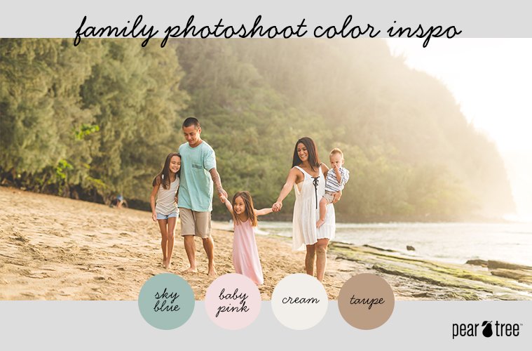
When choosing colors for family photos, it’s important to consider coordinating tones rather than matching everyone’s outfits exactly. Neutral colors like soft pastels, creams, grays, and earth tones work well as they are timeless and create a cohesive look. Additionally, incorporating pops of bold colors or patterns can add visual interest without being overwhelming. Avoid loud colors that may distract from the connection between family members in the photo. Ultimately, choose colors that reflect your family’s style and personality while ensuring harmony in the overall composition.
What color is most flattering for photos?
When it comes to choosing a color that is most flattering for family photos, earth tones tend to work well for most skin tones and can create a warm and cohesive look. Colors such as navy blue, olive green, burgundy, mustard yellow, and rust are all great options. Avoid overly bright colors or loud patterns as they can be distracting in a family photo. Remember, the key is to choose colors that complement each other and create a harmonious overall look.
What colors to wear for family photos outside?
When choosing colors to wear for family photos outside, it’s important to consider the location and time of day. For outdoor photos, earth tones such as greens, blues, browns, and tans tend to work well. These colors complement natural surroundings and help create a cohesive look for the family. Avoid wearing bright neon colors or busy patterns that can be distracting in outdoor settings. Additionally, it’s a good idea to coordinate but not match exactly – mix and match different shades of the same color family for a visually appealing result.
What color scheme is best for summer family pictures?
For summer family pictures, a bright and vibrant color scheme works best. Think about incorporating light pastel colors like soft blues, pinks, yellows, and greens. These colors complement the sunny and warm outdoor setting, creating a cheerful and fresh look for your family photos. Additionally, consider mixing in some neutral tones like white, beige, or light grey to balance out the palette and create a cohesive look for your family’s outfits. Overall, aim for a light and airy feel with your color choices to capture the essence of summer in your family photos.
Frequent Questions
What are some popular color schemes for family photoshoots?
Some popular color schemes for family photoshoots include neutrals with a pop of color, soft pastels, and coordinated earth tones.
How can I choose the right color scheme for my family’s photo session?
Consider the mood and style you want to convey, coordinate colors but avoid being too matchy-matchy, and choose colors that complement each other well.
Are there any tips for coordinating color schemes among family members for a group photo?
Yes, some tips for coordinating color schemes among family members for a group photo include choosing a color palette with complementary shades, avoiding overly matching outfits, and incorporating patterns or textures for visual interest.
In conclusion, choosing the right color schemes for your family photos can truly enhance the overall look and feel of your pictures. Whether you opt for harmonious tones or contrasting colors, remember that the goal is to capture the essence of your family and create lasting memories. Don’t be afraid to experiment and have fun with different combinations to find what works best for your unique family dynamic. Let your colors reflect the love and happiness shared within your family, and you’ll surely end up with stunning family photos that you’ll cherish for years to come.